GlobFam
A brand identity, motion language and launch site for a cross-border family finance platform.

Client
GlobFam Financial Technologies Inc.
Industry
Fintech / Family Finance
Timeline
Completed
Year
2025
Services
Brand Strategy · Logo Design · Motion Design · UI/UX Design · Design System · Frontend Development · Backend Development
01 / The Challenge
Understanding the problem
GlobFam needed a brand from scratch for a family finance platform that works across borders. It had to read as secure and trustworthy, as a finance product must, while feeling warm and family-centred for people managing money between countries. The site also needed a motion style of its own.
02 / The Approach
How we tackled it
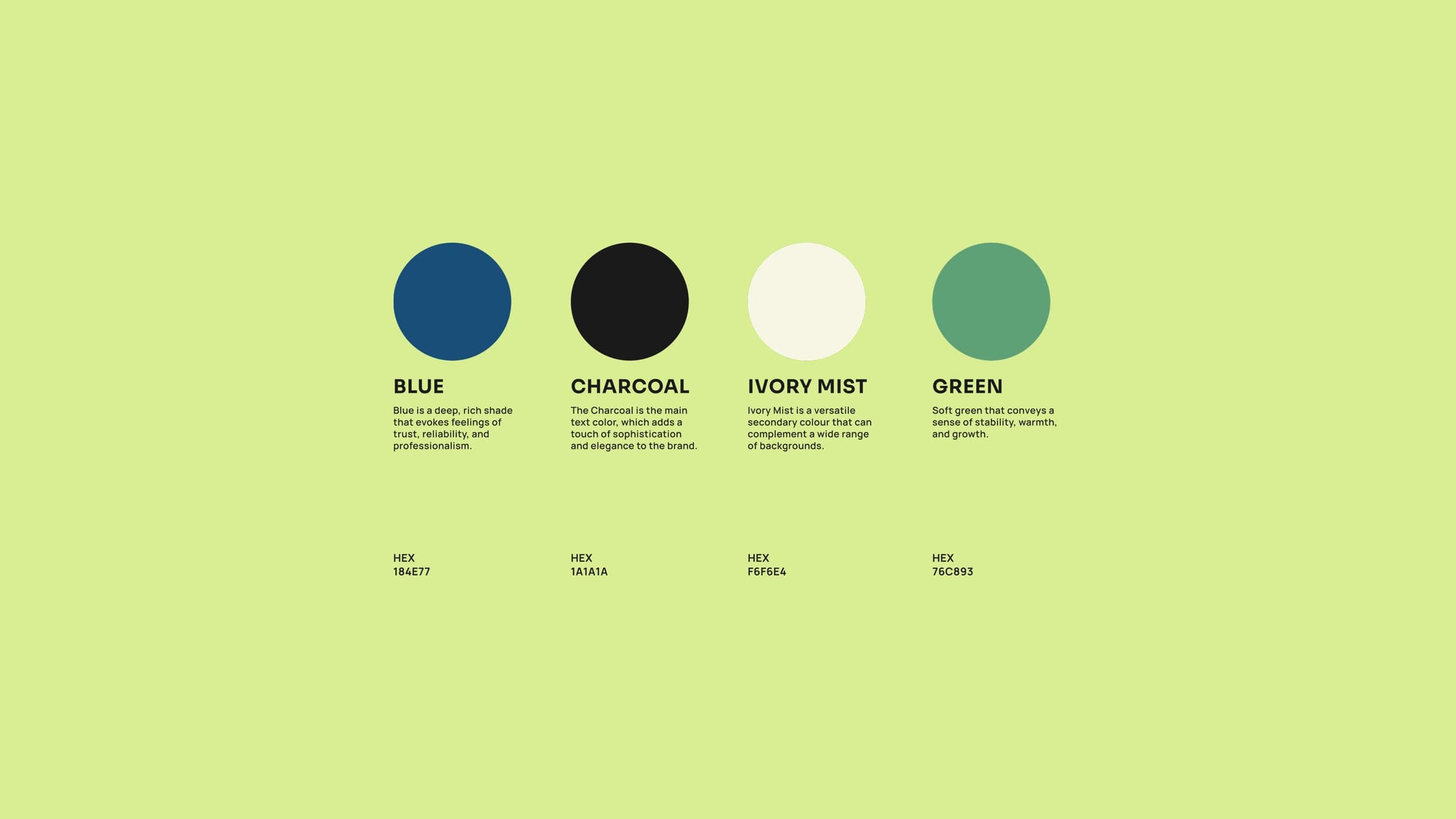
We started from what cross-border families deal with: the stress of international transfers, shared goals and the need to see where money is going. The six-petal flower mark stands for the family, one petal for each member, and for growth. The palette comes from nature: ocean blues for trust, mint greens for growth and soft creams for warmth. The motion language uses spring physics and magnetic interactions.
03 / The Solution
What we built
The brand system includes a thin-stroke six-petal mark with animated variants; a 15-colour palette with a meaning for each colour; a two-typeface system (Sora and Manrope) with fluid type scales; a motion language with custom easing, spring physics and nine reusable animation components; an interactive design system page; and a landing page with glass-effect panels, magnetic hover effects and a working email waitlist.
Tech Stack
04 / The Outcome
Results & impact
GlobFam has a complete identity, a motion language and a documented design system to build the product on, and its site is live at globfam.io.
364+
Animations
15
Brand colours
80+
Components
9
Motion components